UX/UI Design
Reducing Missed School Actions for Parents
Every message matters. But not all messages are equal.
Year :
2024
Industry :
SaaS
Client :
Schoolvoice
Role :
Lead UX/UI Designer

The Problem
"A busy parent opens the app — and has no idea where to start"
Schoolvoice serves parents who are, by definition, busy. A working parent opening the app mid-morning shouldn't have to work to understand what needs their attention. But that's exactly what was happening.
Teachers told us that many parents weren't engaging with messages even though the messages were reaching them. Parents told us the same from their side: messages piled up, and with more than one child, they couldn't tell what mattered from what didn't.
The complaints followed a consistent pattern:
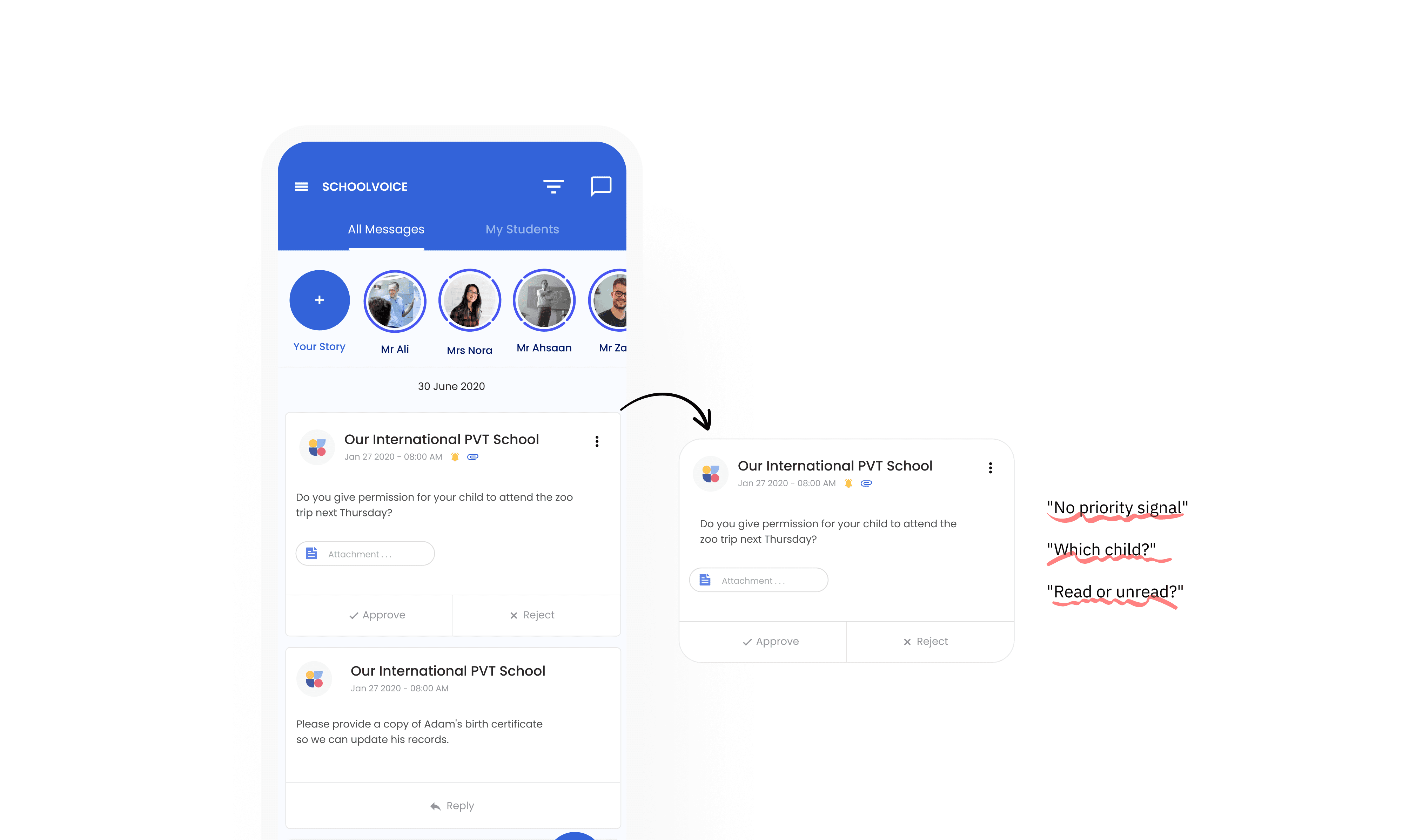
All message types appeared in one undifferentiated list, each with a different purpose, urgency, and required action. A permission slip sat next to a general announcement with no visual distinction.
Parents with several children couldn't tell which message belonged to which child without reading it.
Cards showed no read or unread state, so every session started with scanning everything and understanding nothing at a glance.
Before the redesign, only about 60% of parents acted on messages that required an action, according to the message reports of one of our partner schools. Three message types needed teacher follow-up: acknowledgments, approval requests, and absence excuse requests. These are exactly the messages where a missed response has real consequences.
How I Approached It
"Before designing anything, I wanted to know what parents were actually struggling with."
Start from the complaints, not the screens. I met with the CX team, who shared every complaint they had received from parents and teachers, along with the original messages. I read them directly instead of relying on summaries, so I could see exactly where parents got stuck.
Narrow the focus. Not all messages carry the same weight. I focused on the three types that need a parent's response, because those are where a missed message has a real cost, and where the 60% figure came from.
Separate two problems. Reading the complaints, I saw two different problems that needed different solutions:
Inside the message list: parents couldn't tell messages apart, couldn't tell which child a message was about, and couldn't tell what they had already read. That was a problem of the card.
Before the message list: many parents never noticed the filter list, so they had no way to know what needed attention without searching for it. That was a problem of the entry point.
Design for constraints, not just ideals. Three constraints shaped the work from the start: many students have no profile photo, Arabic names are long (four-part names are common, and many first names are compounds like Abdullah and Abdulrahman), and the backend initially supplied only the child's photo for each message.
Test with people who use it as parents. Each direction was reviewed against these constraints, and before release I tested the redesign internally with Schoolvoice employees who use the app as parents.

Redesigning the Message Card
"The card is the product. Get the anatomy right."
The message card wasn't just a UI element. It was the primary decision surface for every parent using Schoolvoice, so redesigning it meant making deliberate choices about information hierarchy, not just visual styling.
The restructured card establishes a clear reading order. The sender and the child's name appear with immediate prominence. Unread messages show the sender's name in bold with a blue indicator dot, and the CTA is anchored at the bottom of every card so no one has to scan for it.
Telling message types apart. Each type has its own icon and its own color. The action button has two states: gray before the parent acts, and once the action is taken, it adopts the color of its message type. At a glance, a parent sees what is still open.
What I tried and rejected.
Read status as a text label: rejected because the card has too little space for it.
Showing the child only as an avatar: rejected because many students have no profile photo. For parents with several children, the default avatars looked identical.
Working within the constraints. After I showed the backend team why a photo alone wasn't enough, we worked together on exposing at least the child's first name on the card. And because Arabic names run long, the card was designed to hold them without breaking the layout.

The Mini Dashboard:
"Before you read a single message, you already know what matters."
The card redesign solved the micro problem. The mini dashboard at the top of the home screen solved the macro one.
We had noticed that many parents never saw the filter list on the page. So instead of asking parents to find a filter and search for what's new, the dashboard does that work for them. On load, it shows a snapshot per child: the message types requiring action and the count of unread messages. For parents managing several children across different classes and teachers, that replaces a multi-step scan with a single glance. Tapping any element filters the home screen to match, so parents stay in control of where they go next.

The Outcome
"26% increase in parent interaction with messages"
Reported by a partner school after launch, based on their message reports.
In the first month after launch, one of our partner schools reported a 26% increase in parent interaction with messages, based on its own message reports. Schoolvoice doesn't have access to schools' message reports, so this figure comes directly from the school.
The number reflects something specific: parents weren't just opening the app more, they were acting on messages more. The redesign narrowed the gap between receiving a message and responding to it, which is the metric that matters for a communication tool built around school-to-family trust. For a product where an unanswered message can mean a missed field trip or an approval that never arrives, this isn't a design win. It's an operational one.
After launch, feedback relayed through our CX team said the mini dashboard helped parents, especially the busiest ones, know what needed their attention for each child.
More Projects

UX/UI Design
Reducing Missed School Actions for Parents
Every message matters. But not all messages are equal.
Year :
2024
Industry :
SaaS
Client :
Schoolvoice
Role :
Lead UX/UI Designer
The Problem
"A busy parent opens the app — and has no idea where to start"
Schoolvoice serves parents who are, by definition, busy. A working parent opening the app mid-morning shouldn't have to work to understand what needs their attention. But that's exactly what was happening.
Teachers told us that many parents weren't engaging with messages even though the messages were reaching them. Parents told us the same from their side: messages piled up, and with more than one child, they couldn't tell what mattered from what didn't.
The complaints followed a consistent pattern:
All message types appeared in one undifferentiated list, each with a different purpose, urgency, and required action. A permission slip sat next to a general announcement with no visual distinction.
Parents with several children couldn't tell which message belonged to which child without reading it.
Cards showed no read or unread state, so every session started with scanning everything and understanding nothing at a glance.
Before the redesign, only about 60% of parents acted on messages that required an action, according to the message reports of one of our partner schools. Three message types needed teacher follow-up: acknowledgments, approval requests, and absence excuse requests. These are exactly the messages where a missed response has real consequences.
How I Approached It
"Before designing anything, I wanted to know what parents were actually struggling with."
Start from the complaints, not the screens. I met with the CX team, who shared every complaint they had received from parents and teachers, along with the original messages. I read them directly instead of relying on summaries, so I could see exactly where parents got stuck.
Narrow the focus. Not all messages carry the same weight. I focused on the three types that need a parent's response, because those are where a missed message has a real cost, and where the 60% figure came from.
Separate two problems. Reading the complaints, I saw two different problems that needed different solutions:
Inside the message list: parents couldn't tell messages apart, couldn't tell which child a message was about, and couldn't tell what they had already read. That was a problem of the card.
Before the message list: many parents never noticed the filter list, so they had no way to know what needed attention without searching for it. That was a problem of the entry point.
Design for constraints, not just ideals. Three constraints shaped the work from the start: many students have no profile photo, Arabic names are long (four-part names are common, and many first names are compounds like Abdullah and Abdulrahman), and the backend initially supplied only the child's photo for each message.
Test with people who use it as parents. Each direction was reviewed against these constraints, and before release I tested the redesign internally with Schoolvoice employees who use the app as parents.
Redesigning the Message Card
"The card is the product. Get the anatomy right."
The message card wasn't just a UI element. It was the primary decision surface for every parent using Schoolvoice, so redesigning it meant making deliberate choices about information hierarchy, not just visual styling.
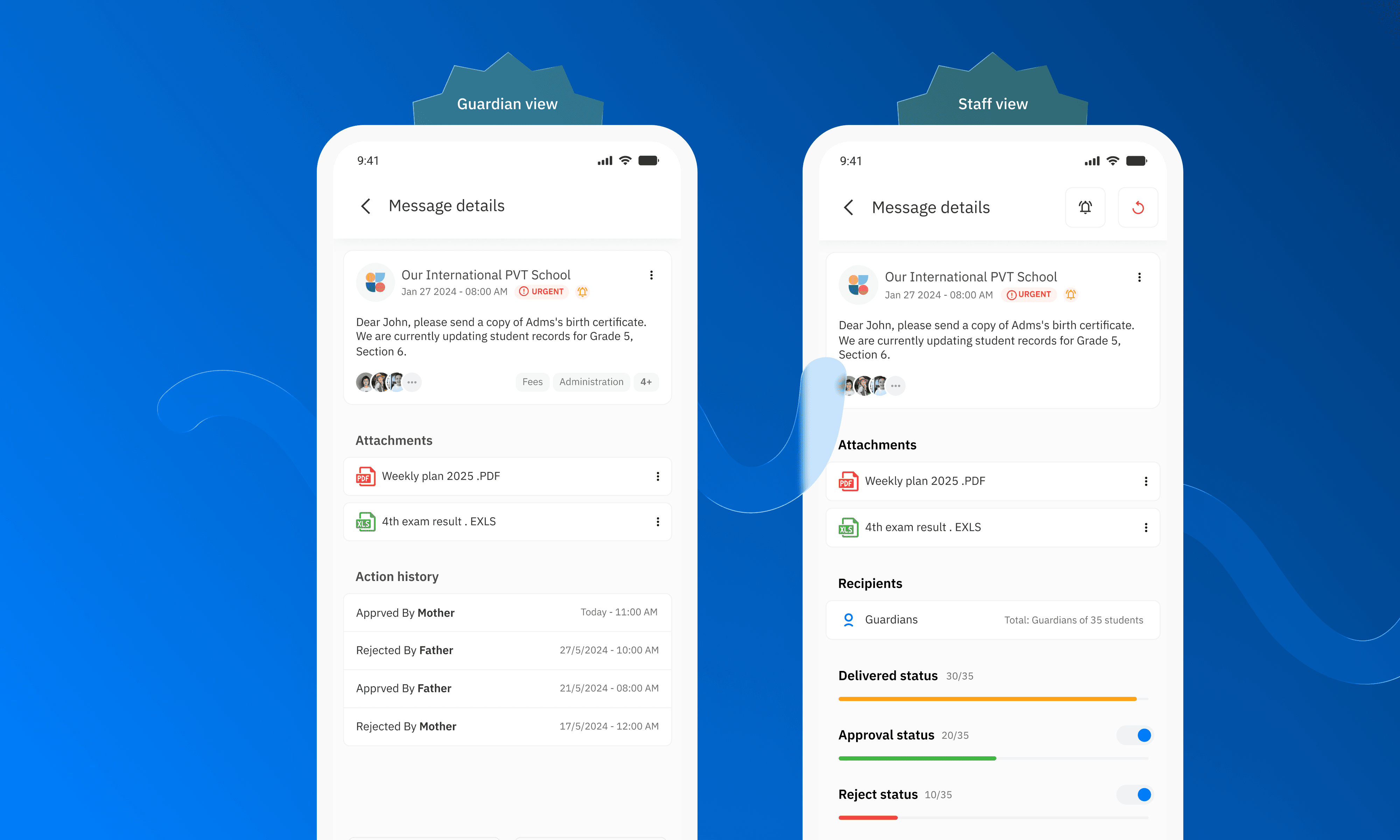
The restructured card establishes a clear reading order. The sender and the child's name appear with immediate prominence. Unread messages show the sender's name in bold with a blue indicator dot, and the CTA is anchored at the bottom of every card so no one has to scan for it.
Telling message types apart. Each type has its own icon and its own color. The action button has two states: gray before the parent acts, and once the action is taken, it adopts the color of its message type. At a glance, a parent sees what is still open.
What I tried and rejected.
Read status as a text label: rejected because the card has too little space for it.
Showing the child only as an avatar: rejected because many students have no profile photo. For parents with several children, the default avatars looked identical.
Working within the constraints. After I showed the backend team why a photo alone wasn't enough, we worked together on exposing at least the child's first name on the card. And because Arabic names run long, the card was designed to hold them without breaking the layout.
The Mini Dashboard:
"Before you read a single message, you already know what matters."
The card redesign solved the micro problem. The mini dashboard at the top of the home screen solved the macro one.
We had noticed that many parents never saw the filter list on the page. So instead of asking parents to find a filter and search for what's new, the dashboard does that work for them. On load, it shows a snapshot per child: the message types requiring action and the count of unread messages. For parents managing several children across different classes and teachers, that replaces a multi-step scan with a single glance. Tapping any element filters the home screen to match, so parents stay in control of where they go next.
The Outcome
"26% increase in parent interaction with messages"
Reported by a partner school after launch, based on their message reports.
In the first month after launch, one of our partner schools reported a 26% increase in parent interaction with messages, based on its own message reports. Schoolvoice doesn't have access to schools' message reports, so this figure comes directly from the school.
The number reflects something specific: parents weren't just opening the app more, they were acting on messages more. The redesign narrowed the gap between receiving a message and responding to it, which is the metric that matters for a communication tool built around school-to-family trust. For a product where an unanswered message can mean a missed field trip or an approval that never arrives, this isn't a design win. It's an operational one.
After launch, feedback relayed through our CX team said the mini dashboard helped parents, especially the busiest ones, know what needed their attention for each child.
More Projects
UX/UI Design
Reducing Missed School Actions for Parents
Every message matters. But not all messages are equal.
Year :
2024
Industry :
SaaS
Client :
Schoolvoice
Role :
Lead UX/UI Designer
The Problem
"A busy parent opens the app — and has no idea where to start"
Schoolvoice serves parents who are, by definition, busy. A working parent opening the app mid-morning shouldn't have to work to understand what needs their attention. But that's exactly what was happening.
Teachers told us that many parents weren't engaging with messages even though the messages were reaching them. Parents told us the same from their side: messages piled up, and with more than one child, they couldn't tell what mattered from what didn't.
The complaints followed a consistent pattern:
All message types appeared in one undifferentiated list, each with a different purpose, urgency, and required action. A permission slip sat next to a general announcement with no visual distinction.
Parents with several children couldn't tell which message belonged to which child without reading it.
Cards showed no read or unread state, so every session started with scanning everything and understanding nothing at a glance.
Before the redesign, only about 60% of parents acted on messages that required an action, according to the message reports of one of our partner schools. Three message types needed teacher follow-up: acknowledgments, approval requests, and absence excuse requests. These are exactly the messages where a missed response has real consequences.
How I Approached It
"Before designing anything, I wanted to know what parents were actually struggling with."
Start from the complaints, not the screens. I met with the CX team, who shared every complaint they had received from parents and teachers, along with the original messages. I read them directly instead of relying on summaries, so I could see exactly where parents got stuck.
Narrow the focus. Not all messages carry the same weight. I focused on the three types that need a parent's response, because those are where a missed message has a real cost, and where the 60% figure came from.
Separate two problems. Reading the complaints, I saw two different problems that needed different solutions:
Inside the message list: parents couldn't tell messages apart, couldn't tell which child a message was about, and couldn't tell what they had already read. That was a problem of the card.
Before the message list: many parents never noticed the filter list, so they had no way to know what needed attention without searching for it. That was a problem of the entry point.
Design for constraints, not just ideals. Three constraints shaped the work from the start: many students have no profile photo, Arabic names are long (four-part names are common, and many first names are compounds like Abdullah and Abdulrahman), and the backend initially supplied only the child's photo for each message.
Test with people who use it as parents. Each direction was reviewed against these constraints, and before release I tested the redesign internally with Schoolvoice employees who use the app as parents.
Redesigning the Message Card
"The card is the product. Get the anatomy right."
The message card wasn't just a UI element. It was the primary decision surface for every parent using Schoolvoice, so redesigning it meant making deliberate choices about information hierarchy, not just visual styling.
The restructured card establishes a clear reading order. The sender and the child's name appear with immediate prominence. Unread messages show the sender's name in bold with a blue indicator dot, and the CTA is anchored at the bottom of every card so no one has to scan for it.
Telling message types apart. Each type has its own icon and its own color. The action button has two states: gray before the parent acts, and once the action is taken, it adopts the color of its message type. At a glance, a parent sees what is still open.
What I tried and rejected.
Read status as a text label: rejected because the card has too little space for it.
Showing the child only as an avatar: rejected because many students have no profile photo. For parents with several children, the default avatars looked identical.
Working within the constraints. After I showed the backend team why a photo alone wasn't enough, we worked together on exposing at least the child's first name on the card. And because Arabic names run long, the card was designed to hold them without breaking the layout.
The Mini Dashboard:
"Before you read a single message, you already know what matters."
The card redesign solved the micro problem. The mini dashboard at the top of the home screen solved the macro one.
We had noticed that many parents never saw the filter list on the page. So instead of asking parents to find a filter and search for what's new, the dashboard does that work for them. On load, it shows a snapshot per child: the message types requiring action and the count of unread messages. For parents managing several children across different classes and teachers, that replaces a multi-step scan with a single glance. Tapping any element filters the home screen to match, so parents stay in control of where they go next.
The Outcome
"26% increase in parent interaction with messages"
Reported by a partner school after launch, based on their message reports.
In the first month after launch, one of our partner schools reported a 26% increase in parent interaction with messages, based on its own message reports. Schoolvoice doesn't have access to schools' message reports, so this figure comes directly from the school.
The number reflects something specific: parents weren't just opening the app more, they were acting on messages more. The redesign narrowed the gap between receiving a message and responding to it, which is the metric that matters for a communication tool built around school-to-family trust. For a product where an unanswered message can mean a missed field trip or an approval that never arrives, this isn't a design win. It's an operational one.
After launch, feedback relayed through our CX team said the mini dashboard helped parents, especially the busiest ones, know what needed their attention for each child.