UX/UI Design
Unifying the Product Experience
One product. Two platforms. Zero consistency — until now.
Year :
2026
Industry :
SaaS
Client :
Schoolvoice
Role :
Lead UX/UI Designer

The Problem:
"A product that felt like two different apps"
Schoolvoice runs on web and mobile, but for teachers moving between the two, the experience was anything but seamless. I noticed it myself while using both side by side: they didn't feel like one product, in how they looked or in how flows worked.
The disconnect wasn't cosmetic. It was structural:
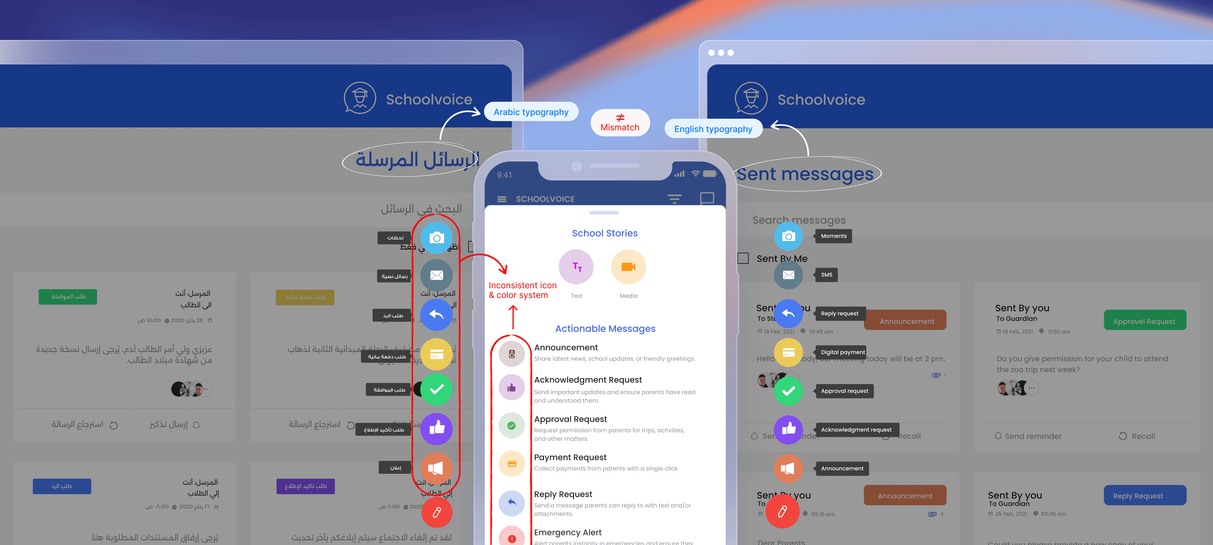
Typography: Arabic and English behaved differently across platforms. The Arabic typeface was oversized and visually heavy next to its English counterpart, breaking reading rhythm.
Icons: The same feature carried different visual treatments depending on where you opened the app.
Color: The same action looked different on web and mobile, eroding the mental model teachers built over time.
Workflow: Sent, Draft, and Scheduled Messages existed only on web, so teachers who started on mobile had to switch platforms mid-task.
To understand why, I audited 30+ screens and 20+ icons across both platforms, then talked with the developers who built the earlier versions. The answer wasn't carelessness: no design system or guidelines existed. Web and mobile had been built independently, and the company had no UI/UX designer when it was founded.
Without a shared visual language, every screen felt like a negotiation between two separate products. The task wasn't "fix inconsistent screens." It was "build the missing foundation."
Design Decisions:
"Building a design system from the ground up for two platforms and multiple brands"
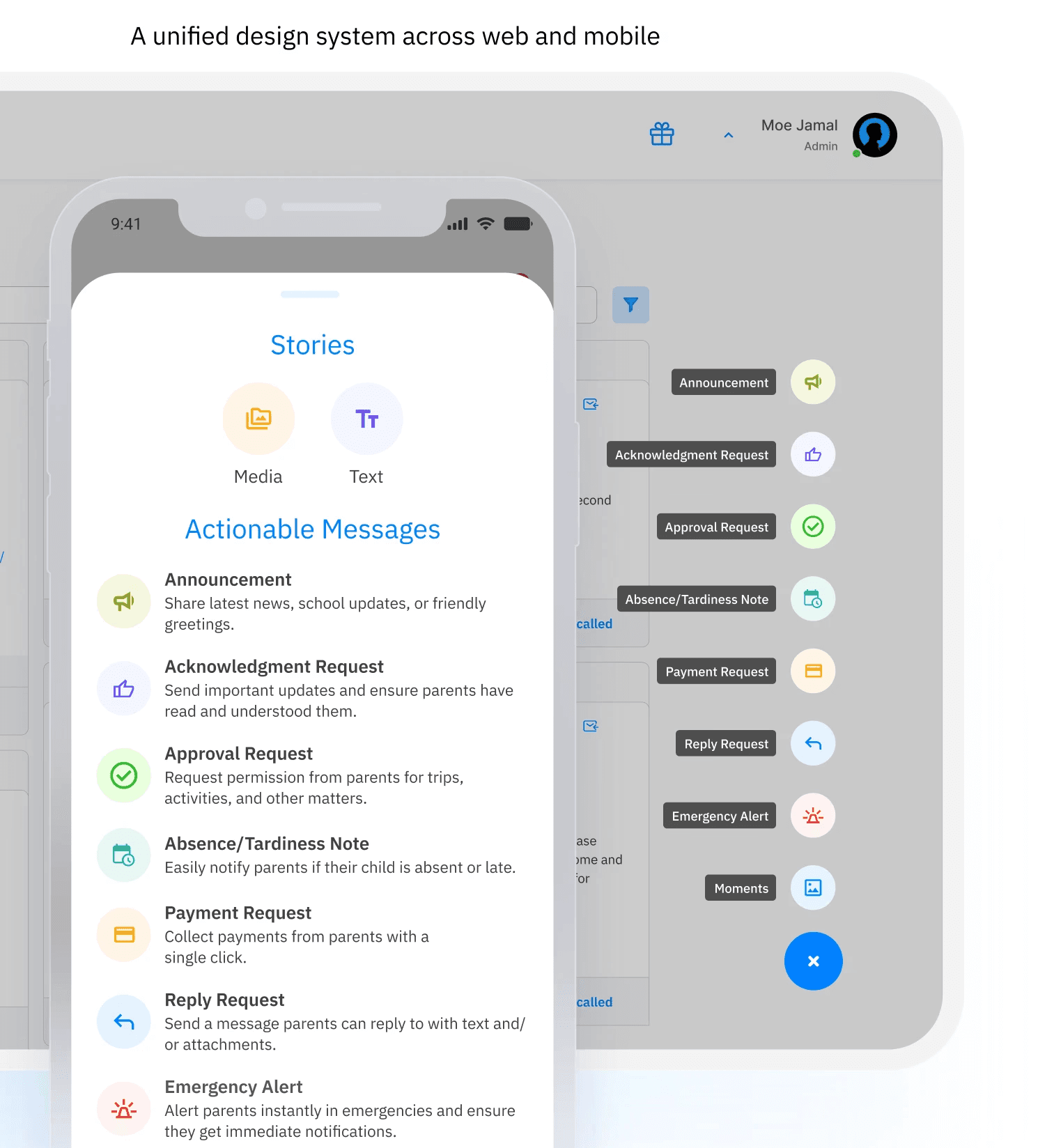
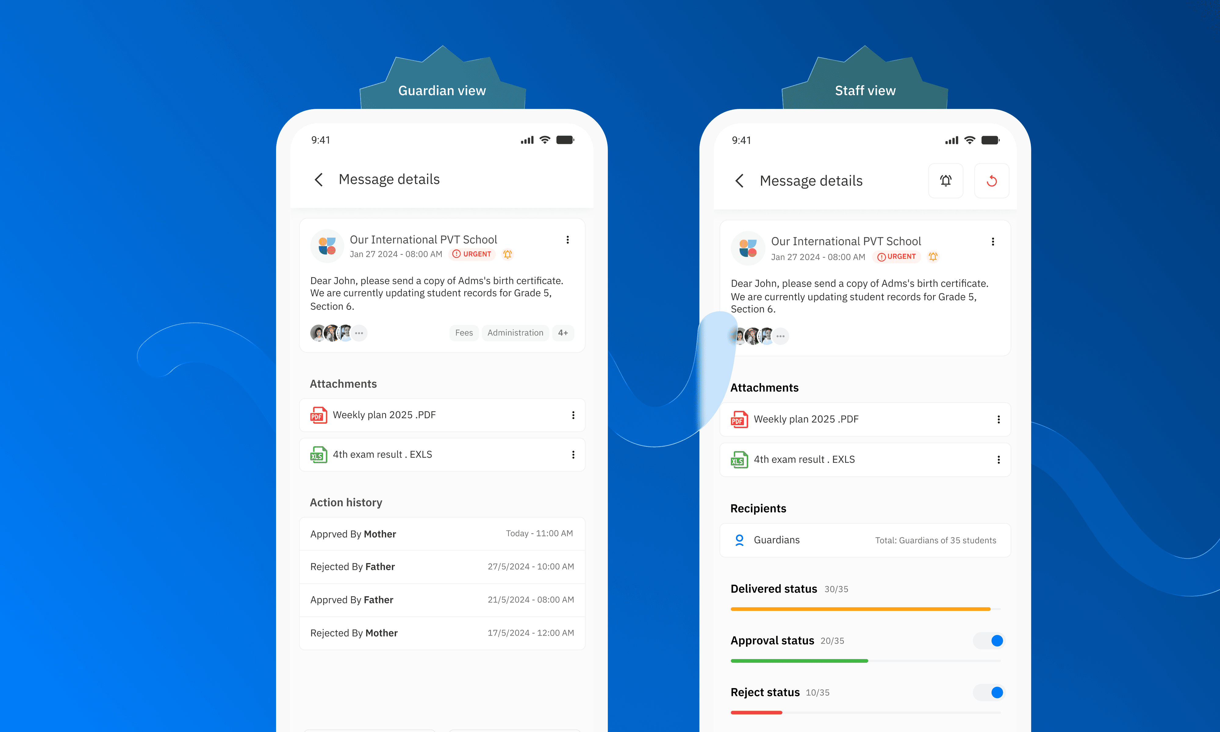
The solution wasn't a visual refresh. It was an infrastructure problem that needed a systematic answer. I built Schoolvoice's first unified design system, covering web and mobile. The core decisions:
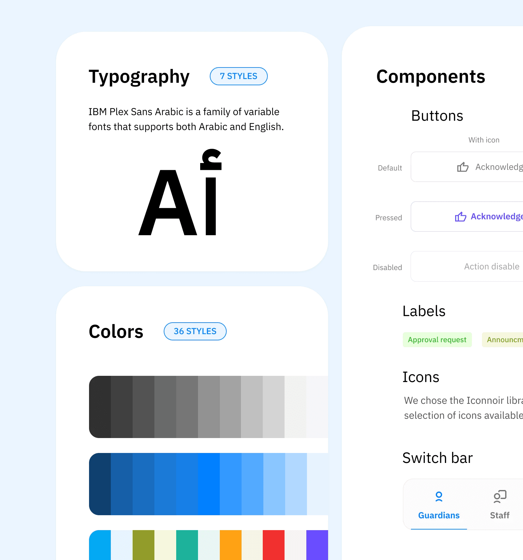
Typography: I needed one family that supports Arabic and Latin at equal visual weight. I tested candidates on real web and mobile screens. I rejected "Alexandria" because its letterforms ran too large, and "Baloo Bhaijaan" because it doesn't support English. The final family makes bilingual layouts behave predictably on both platforms.
Iconography: I consolidated 20+ icons from multiple sets into one library, mapped to feature identity rather than platform.
Color system: I tested shades and gradients across real screens, refining them over many review rounds with developers and the CX team, and checked contrast between dark and light shades with the Stark plugin in Figma. The result is a token-based architecture that supports white-label clients: brand colors flex per client without breaking the underlying system. This directly reduced the product team's review time per screen.
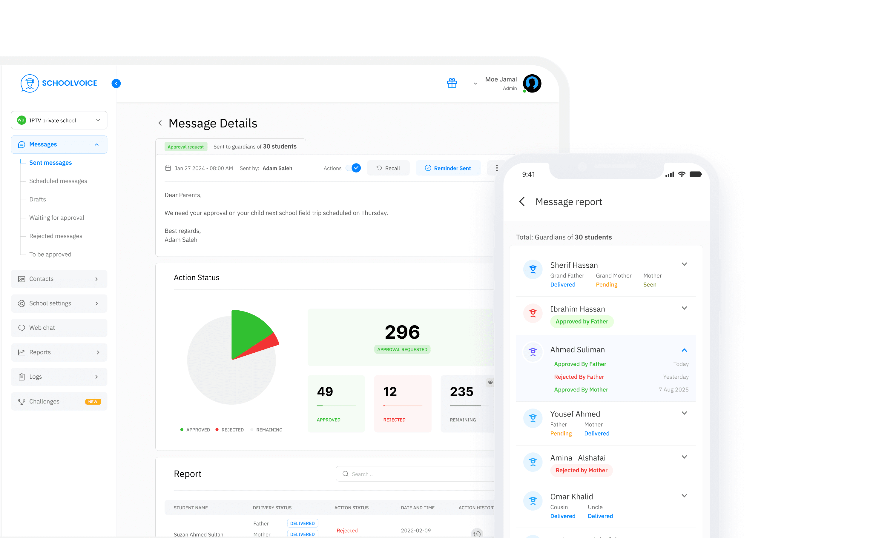
Feature parity: I brought Sent, Draft, and Scheduled Messages to mobile, so teachers no longer switch platforms mid-flow.
Handoff: I delivered everything as a Figma component library with design tokens, so developers build from one source instead of interpreting individual screens.
The Outcome:
"Less review time. Less friction. One product that finally feels like one."
Before release, I tested the system internally with team members who use the app as parents at their children's schools. After launch, schools and parents responded positively.
The design system became the single source of truth for design and engineering. New screens and white-label reviews that once required back-and-forth could now be checked against a documented standard.
The most measurable impact came from the token-based color architecture. Before the system, onboarding a white-label client took a full week of manual review across every screen. Afterward, switching a client's primary color became a single variable change in the codebase, reducing a week of review work to under two hours.
Teachers no longer needed to switch platforms to finish their messaging workflow. Drafting, scheduling, and tracking messages became device-agnostic for the first time. Parents said the app felt clearer and cleaner than before. A teacher told us that web and mobile now feel visually connected, and that they recognize features by color and icon without reading the labels.
For a product built on trust between schools and families, consistency isn't just a design value. It's a credibility signal.
What This Taught Me:
"A design system is a product decision, not a design deliverable"
Talking to the developers changed my diagnosis. The problem wasn't taste; it was missing infrastructure, and I wouldn't have seen that from the screens alone.
The hardest part wasn't building the system, it was making the case for it. A design system has no immediate visible output. Its value shows up in the work it quietly prevents: the mismatched component, the off-brand white-label, the review meeting that didn't need to happen.
Building for white-label from day one forced a discipline most design systems skip: designing for variability, not just consistency. Every token had to work for Schoolvoice's brand and for a school with completely different brand colors, without breaking either. That constraint made the system more resilient, not more complicated.
More Projects

UX/UI Design
Unifying the Product Experience
One product. Two platforms. Zero consistency — until now.
Year :
2026
Industry :
SaaS
Client :
Schoolvoice
Role :
Lead UX/UI Designer
The Problem:
"A product that felt like two different apps"
Schoolvoice runs on web and mobile, but for teachers moving between the two, the experience was anything but seamless. I noticed it myself while using both side by side: they didn't feel like one product, in how they looked or in how flows worked.
The disconnect wasn't cosmetic. It was structural:
Typography: Arabic and English behaved differently across platforms. The Arabic typeface was oversized and visually heavy next to its English counterpart, breaking reading rhythm.
Icons: The same feature carried different visual treatments depending on where you opened the app.
Color: The same action looked different on web and mobile, eroding the mental model teachers built over time.
Workflow: Sent, Draft, and Scheduled Messages existed only on web, so teachers who started on mobile had to switch platforms mid-task.
To understand why, I audited 30+ screens and 20+ icons across both platforms, then talked with the developers who built the earlier versions. The answer wasn't carelessness: no design system or guidelines existed. Web and mobile had been built independently, and the company had no UI/UX designer when it was founded.
Without a shared visual language, every screen felt like a negotiation between two separate products. The task wasn't "fix inconsistent screens." It was "build the missing foundation."
Design Decisions:
"Building a design system from the ground up for two platforms and multiple brands"
The solution wasn't a visual refresh. It was an infrastructure problem that needed a systematic answer. I built Schoolvoice's first unified design system, covering web and mobile. The core decisions:
Typography: I needed one family that supports Arabic and Latin at equal visual weight. I tested candidates on real web and mobile screens. I rejected "Alexandria" because its letterforms ran too large, and "Baloo Bhaijaan" because it doesn't support English. The final family makes bilingual layouts behave predictably on both platforms.
Iconography: I consolidated 20+ icons from multiple sets into one library, mapped to feature identity rather than platform.
Color system: I tested shades and gradients across real screens, refining them over many review rounds with developers and the CX team, and checked contrast between dark and light shades with the Stark plugin in Figma. The result is a token-based architecture that supports white-label clients: brand colors flex per client without breaking the underlying system. This directly reduced the product team's review time per screen.
Feature parity: I brought Sent, Draft, and Scheduled Messages to mobile, so teachers no longer switch platforms mid-flow.
Handoff: I delivered everything as a Figma component library with design tokens, so developers build from one source instead of interpreting individual screens.
The Outcome:
"Less review time. Less friction. One product that finally feels like one."
Before release, I tested the system internally with team members who use the app as parents at their children's schools. After launch, schools and parents responded positively.
The design system became the single source of truth for design and engineering. New screens and white-label reviews that once required back-and-forth could now be checked against a documented standard.
The most measurable impact came from the token-based color architecture. Before the system, onboarding a white-label client took a full week of manual review across every screen. Afterward, switching a client's primary color became a single variable change in the codebase, reducing a week of review work to under two hours.
Teachers no longer needed to switch platforms to finish their messaging workflow. Drafting, scheduling, and tracking messages became device-agnostic for the first time. Parents said the app felt clearer and cleaner than before. A teacher told us that web and mobile now feel visually connected, and that they recognize features by color and icon without reading the labels.
For a product built on trust between schools and families, consistency isn't just a design value. It's a credibility signal.
What This Taught Me:
"A design system is a product decision, not a design deliverable"
Talking to the developers changed my diagnosis. The problem wasn't taste; it was missing infrastructure, and I wouldn't have seen that from the screens alone.
The hardest part wasn't building the system, it was making the case for it. A design system has no immediate visible output. Its value shows up in the work it quietly prevents: the mismatched component, the off-brand white-label, the review meeting that didn't need to happen.
Building for white-label from day one forced a discipline most design systems skip: designing for variability, not just consistency. Every token had to work for Schoolvoice's brand and for a school with completely different brand colors, without breaking either. That constraint made the system more resilient, not more complicated.
More Projects
UX/UI Design
Unifying the Product Experience
One product. Two platforms. Zero consistency — until now.
Year :
2026
Industry :
SaaS
Client :
Schoolvoice
Role :
Lead UX/UI Designer
The Problem:
"A product that felt like two different apps"
Schoolvoice runs on web and mobile, but for teachers moving between the two, the experience was anything but seamless. I noticed it myself while using both side by side: they didn't feel like one product, in how they looked or in how flows worked.
The disconnect wasn't cosmetic. It was structural:
Typography: Arabic and English behaved differently across platforms. The Arabic typeface was oversized and visually heavy next to its English counterpart, breaking reading rhythm.
Icons: The same feature carried different visual treatments depending on where you opened the app.
Color: The same action looked different on web and mobile, eroding the mental model teachers built over time.
Workflow: Sent, Draft, and Scheduled Messages existed only on web, so teachers who started on mobile had to switch platforms mid-task.
To understand why, I audited 30+ screens and 20+ icons across both platforms, then talked with the developers who built the earlier versions. The answer wasn't carelessness: no design system or guidelines existed. Web and mobile had been built independently, and the company had no UI/UX designer when it was founded.
Without a shared visual language, every screen felt like a negotiation between two separate products. The task wasn't "fix inconsistent screens." It was "build the missing foundation."
Design Decisions:
"Building a design system from the ground up for two platforms and multiple brands"
The solution wasn't a visual refresh. It was an infrastructure problem that needed a systematic answer. I built Schoolvoice's first unified design system, covering web and mobile. The core decisions:
Typography: I needed one family that supports Arabic and Latin at equal visual weight. I tested candidates on real web and mobile screens. I rejected "Alexandria" because its letterforms ran too large, and "Baloo Bhaijaan" because it doesn't support English. The final family makes bilingual layouts behave predictably on both platforms.
Iconography: I consolidated 20+ icons from multiple sets into one library, mapped to feature identity rather than platform.
Color system: I tested shades and gradients across real screens, refining them over many review rounds with developers and the CX team, and checked contrast between dark and light shades with the Stark plugin in Figma. The result is a token-based architecture that supports white-label clients: brand colors flex per client without breaking the underlying system. This directly reduced the product team's review time per screen.
Feature parity: I brought Sent, Draft, and Scheduled Messages to mobile, so teachers no longer switch platforms mid-flow.
Handoff: I delivered everything as a Figma component library with design tokens, so developers build from one source instead of interpreting individual screens.
The Outcome:
"Less review time. Less friction. One product that finally feels like one."
Before release, I tested the system internally with team members who use the app as parents at their children's schools. After launch, schools and parents responded positively.
The design system became the single source of truth for design and engineering. New screens and white-label reviews that once required back-and-forth could now be checked against a documented standard.
The most measurable impact came from the token-based color architecture. Before the system, onboarding a white-label client took a full week of manual review across every screen. Afterward, switching a client's primary color became a single variable change in the codebase, reducing a week of review work to under two hours.
Teachers no longer needed to switch platforms to finish their messaging workflow. Drafting, scheduling, and tracking messages became device-agnostic for the first time. Parents said the app felt clearer and cleaner than before. A teacher told us that web and mobile now feel visually connected, and that they recognize features by color and icon without reading the labels.
For a product built on trust between schools and families, consistency isn't just a design value. It's a credibility signal.
What This Taught Me:
"A design system is a product decision, not a design deliverable"
Talking to the developers changed my diagnosis. The problem wasn't taste; it was missing infrastructure, and I wouldn't have seen that from the screens alone.
The hardest part wasn't building the system, it was making the case for it. A design system has no immediate visible output. Its value shows up in the work it quietly prevents: the mismatched component, the off-brand white-label, the review meeting that didn't need to happen.
Building for white-label from day one forced a discipline most design systems skip: designing for variability, not just consistency. Every token had to work for Schoolvoice's brand and for a school with completely different brand colors, without breaking either. That constraint made the system more resilient, not more complicated.